Home Creating a Design System: Crafting Consistency Across Applications
A design system isn’t just about the code, it actually starts with solving a problem in the design world. In a lot of companies, even though design teams try hard to keep a consistent look, making sure everything matches up across different designs isn’t easy. A design system kicks off with the design work and then gets turned into code, helping to roll out these design rules across several projects and keep things looking and working together smoothly. You’ll often see the need for a design system when you’re working on a bunch of apps at once and start to spot the same features popping up, but they’re not quite the same each time. These little style differences show that there’s no clear, shared design playbook being followed. That’s when a design system steps in – to make sure everyone’s on the same page with design across all your apps.
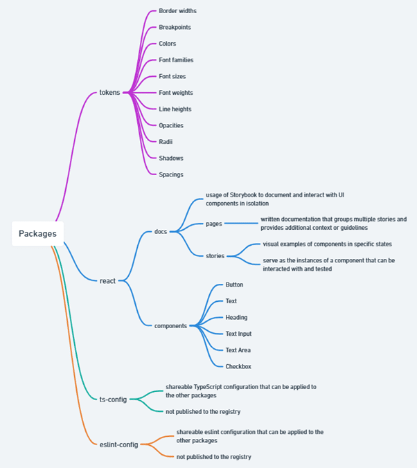
The following image essentially illustrates what we are going to build and what each package will contain. We have Tokens, which are the basic rules dictating your project’s appearance, ensuring everything remains consistent. Some other ‘Packages’ provide ready-made components, like buttons and text fields, simplifying the assembly of your website or app. In the ‘Documentation’ section, we utilise Storybook to demonstrate how each part operates. The ‘Stories’ are practical examples that allow us to test components in various scenarios. And finally, we have tools that organise the code behind the scenes, making sure everything runs smoothly. We are constructing a toolbox that ensures your project is not only aesthetically pleasing but also user-friendly.
In environments where projects are interdependent, a monorepo approach is adopted, centralising multiple projects within a single repository. The project will be structured into packages. To create each package, the following steps are taken:
To enhance this setup, we will rely on Turborepo, which enables parallel script execution and utilises caching for efficient builds, thereby optimising the development workflow.
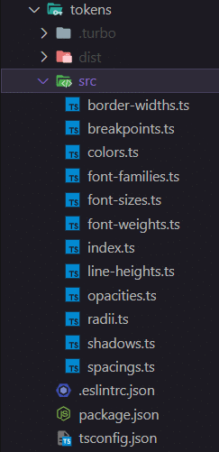
Regarding the tokens package, we have created several TypeScript files to establish the foundational elements of the interface, including colors, font sizes, font weights, spacings, and line heights. By encapsulating these details into tokens, we ensure that their implementation is both consistent and reusable.
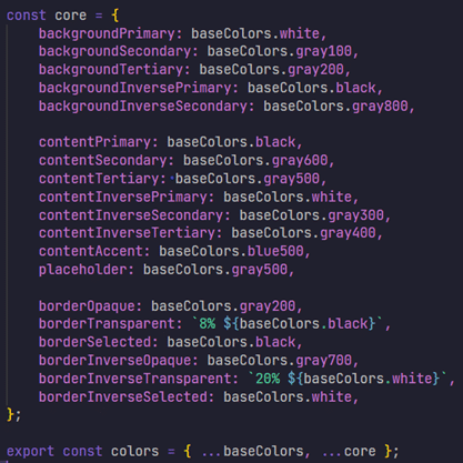
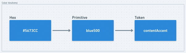
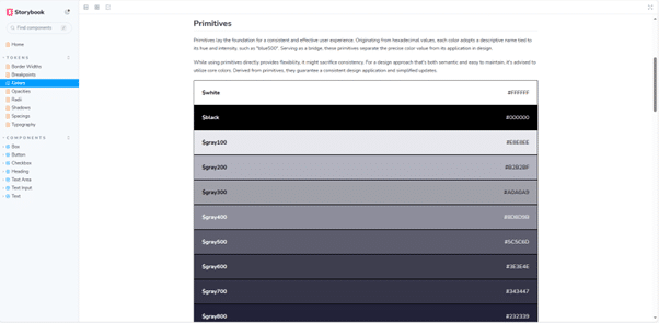
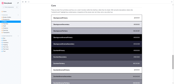
In the example provided below, specific colors have been designated to ensure both consistency and effectiveness in the user experience. Each color begins as a hexadecimal value, but other color formats could also be used. This value is then assigned to a more descriptive label, often indicative of its shade and intensity, such as “blue500.” These labels serve as an intermediary, separating the precise color value from its semantic or functional use within the interface. Ultimately, these labels are linked to semantic tokens. These tokens articulate the role or purpose of the color within the interface, rather than the color itself. For instance, a token named “contentAccent” might be utilised to highlight critical sections of content, regardless of whether it’s blue, red, or any other hue.
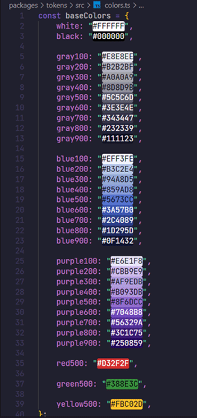
Additional tokens have been configured for use. For detailed information on each and to see examples, please check the source code.
A design system is at its best when it’s technology-agnostic. Creating components that are not strictly tied to a particular technology can be quite challenging though. To facilitate this, we’ve structured our design system into segments, carving out a dedicated space for the components implemented using React. Note that tokens, for instance, are designed to be versatile, fitting into a wide array of projects and they are not tied to a particular technology, which means they can be used in a bigger variety of projects and that’s why they were created separately.
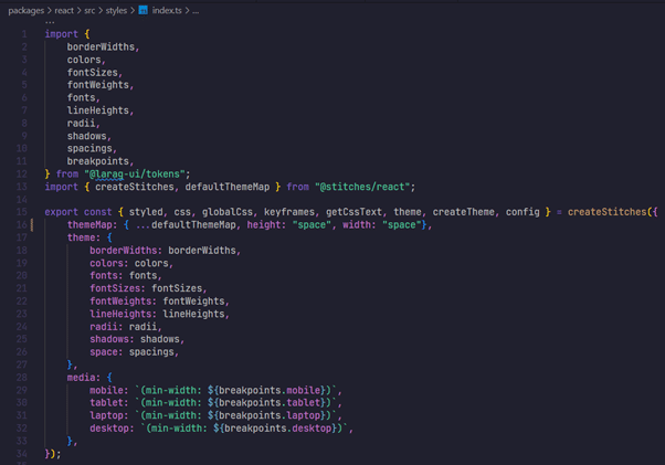
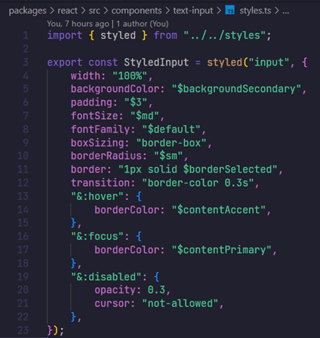
We’ve chosen Stitches, a CSS-in-JS library, for styling these components. The configuration shown in the image below includes theme tokens, custom utilities, and media queries. It’s important to note that our design system’s tokens will be utilised here.
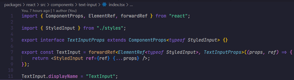
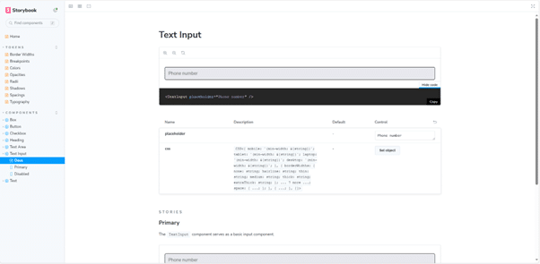
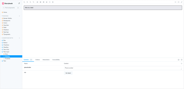
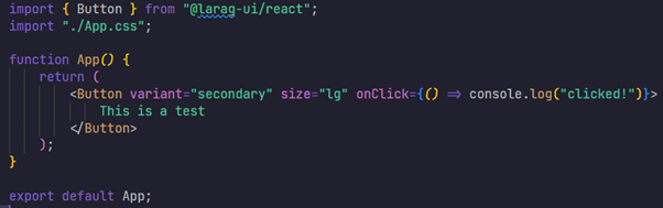
Observe the text input component presented below. Upon the release of our design system, the integration process into your application will be straightforward. It requires simply installing the package and importing the necessary components. We’re using a design system Storybook for our documentation. It’s an open-source tool that’s great for seeing your UI components in action and playing around with them in different states. Storybook serves as an interactive guide to our components, a topic we shall examine more comprehensively in a subsequent post for clarity and thoroughness.
Several additional components have been developed during this phase. For those interested in a more in-depth exploration, we encourage you to review the source code.
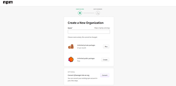
Deploying packages of a design system involves some key steps, especially when dealing with a monorepo containing multiple packages that will be distributed via npm. The first important thing to mention is that you need to create an account on npm and create an organization there. Note that this is the foundational step that allows for the subsequent publishing and management of the packages.
Managing versioning within a monorepo can present some challenges. Unlike a single-package repository, a monorepo can contain multiple packages, each with its own versioning and timeline of changes. To handle this complexity, a tool called Changesets has been selected to streamline version control across the monorepo.
Essentially, Changesets help us track changes in individual packages, making it easier to manage different versions and updates that occur over time within the same repository. This is significant because it allows us to avoid the pitfall of versioning the monorepo as a whole, which can lead to confusion and inconsistencies. In order to get started with Changesets, simply install the CLI tool in your project as a development dependency:
After this step, in order to add a new changeset, which will basically prompt you to detail the changes made, you can run the following command:
Lastly, when it’s time to release a new version and publish a package, the process is as follows:
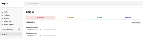
Once you’ve published a new version, the updated packages will be visible within your organization on npm. This ensures that anyone using your design system can access the latest updates and features of your packages.
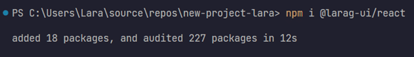
Now, whenever you want to add these packages to some other project for instance, you simply need to install them.
While this design system was initially developed for demonstration purposes, adapting it for larger-scale operations requires considering some additional steps. For instance, implementing a CI/CD pipeline is recommended for automating builds, tests, and deployments, which helps ensure that updates are delivered quickly and reliably. Also, establishing a separate project specifically for documentation and testing could be beneficial. This would provide a space to document in depth the components and offer users an interactive experience. In general, maintaining separate documentation facilitates a cleaner and more manageable process.
In short, we’ve set up a design system because we needed a flexible foundation that could evolve with our brand’s style. The interesting part is how these tools help us work smarter. They basically streamline how we create digital stuff, making sure everything stays fresh and aligned. Plus, we’ve got the tokens which act like the foundational elements for our design’s look, making sure we keep things consistent and reusable. Additionally, the components serve as reusable pieces, so we don’t have to start from scratch every time we kick off a new project. It’s a huge timesaver.
References


